Let’s settle this. You’ve heard the music, you’ve seen the TV show, but the real story of the Pre-Fab Four’s rebellion and artistic growth is etched right into their cardboard sleeves. Putting together a list of The Monkees album covers ranked isn’t just about picking pretty pictures; it’s about charting their journey from a manufactured pop act to a legitimate, creative force. This is the definitive, no-nonsense ranking from the vinyl obsessives here at Vinyl Gold UK.
We’re judging these based on artistry, historical context, photographic quality, and the sheer story they tell. Some are iconic, some are disasters, but all of them are fascinating artifacts of the 1960s.
Decoding the Sleeve: The Criteria for Ranking
Before we dive into the countdown, what makes one Monkees cover a masterpiece and another a piece of marketing fluff? It’s not a simple science, but we have our standards.
Artistry vs. Marketing
Some covers were designed to sell a product tied to a TV show. Others were meant to be pieces of art that complemented the music within. The best ones managed to do both, but we give heavy points to the sleeves where the band’s burgeoning creative identity shines through, pushing back against the corporate machine. It’s the visual equivalent of them demanding to play their own instruments.
Photographic Merit and Design
We’re looking at the quality of the photography itself. Who was behind the lens? Was the composition deliberate and evocative? The use of typography, colour palettes, and layout all play a massive role. A simple, well-executed concept often beats a cluttered, unfocused mess.
The Story Behind the Shot
Every cover has a backstory. Was it a rushed photo session? A deliberate artistic statement? A concept the band loved or, famously, one they loathed? The context is everything. The tension, rebellion, and eventual creative freedom of Micky, Davy, Mike, and Peter are all visible if you know where to look.
The Bottom of the Heap: When the Magic Faded
Not every cover can be a winner. These are the sleeves that either missed the mark, felt uninspired, or represented a sad end to a brilliant chapter in pop history.
#11. Changes (1970)
This one is just sad. With only Micky Dolenz and Davy Jones remaining, the cover for Changes feels as empty as the band’s lineup. The stark, high-contrast portraits against a plain white background scream “contractual obligation.” It’s a visual full-stop, lacking any of the joy, chaos, or psychedelic energy that defined their imperial phase. It’s the visual equivalent of a party ending with the lights flicking on.
#10. Good Times! (2016)
Look, it’s a perfectly competent, modern cover. The retro font and the bright, poppy colours are a nice nod to their heyday. But that’s all it is—a nod. It feels like a tribute act’s album cover. It lacks the authentic, chaotic 1960s energy and the feeling that anything could happen. It’s a well-designed product, but it doesn’t have the soul of the originals.
#9. The Monkees Present (1969)
By 1969, The Monkees were barely a cohesive unit, and this cover shows it. The four separate portraits feel completely disconnected, like four solo artists forced onto one sleeve. It’s an honest reflection of the band’s internal state—splintering and heading in different directions—but it makes for a disjointed and unsatisfying album cover. There’s no chemistry, no group dynamic, just four guys in a grid.
#8. Instant Replay (1969)

Another album from their later period, Instant Replay, has a cover that is conceptually interesting but messy in execution. The idea of mixing vintage TV-era photos with newer, more mature shots of the band is clever, but the final product is cluttered. It feels like a scrapbook, but one that’s been assembled in a hurry. It’s a visual representation of a band trying to reconcile its past with a very uncertain future.
The Solid Mid-Pack: Strong Ideas, Mixed Results
These covers are far from bad. They are memorable and important in their own right, but they just lack that extra spark of genius that would push them into the top tier.
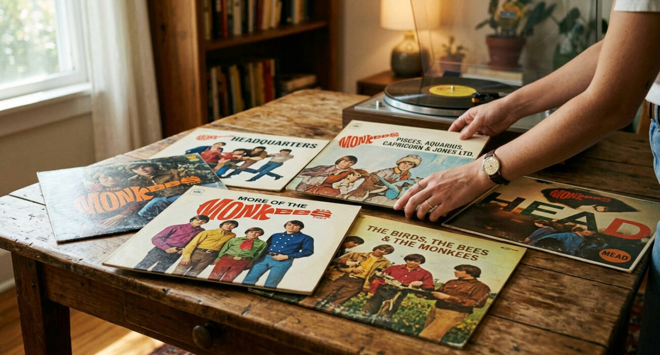
#7. The Birds, The Bees & The Monkees (1968)
This cover is pure, unadulterated chaos, and that’s both its strength and its weakness. Designed to look like a cluttered collage or a fan’s scrapbook, it’s bursting with personality. You have candid shots, weird drawings, and random bits of text. It’s a bold artistic choice that completely abandons the clean, commercial look of their early work.
The problem? It’s almost too messy. It’s hard to focus on any single element, and it can feel a bit overwhelming. It’s a fascinating piece that captures the zany, anything-goes spirit of 1968, but it’s not a design that hangs together as a cohesive whole.
#6. Head (1968)
As a piece of minimalist, conceptual art, the cover for the Head soundtrack is brilliant. It features a stark, solarized image of Micky Dolenz’s head (with silver hair, a look from the film) against a black void. It’s weird, it’s unsettling, and it perfectly captures the deconstructionist, surreal nature of the movie it accompanies. This was The Monkees blowing up their own image in the most spectacular way possible.
The involvement of figures like Jack Nicholson in the film’s creation and the chaotic, layered sound of the music, sometimes reminiscent of Phil Spector’s Wall of Sound production, made this a truly avant-garde project. The cover is a warning: this is not the TV show. Why isn’t it higher? Because while it’s a fantastic piece of art, it’s almost too alienating. It lacks the warmth and personality that define the very best Monkees covers.
“We’re the young generation, and we’ve got something to say.” – Davy Jones
This quote, from their hit “I’m a Believer,” perfectly encapsulates the shift they were making. The Head cover was them saying something completely different, and many people weren’t ready to listen.
#5. The Monkees (1966)
The one that started it all. The four-panel, colour-tinted grid of their faces is one of the most recognizable album covers of the 1960s. It’s a masterclass in branding. In one image, you get the personality of each member: Davy the heartthrob, Micky the goofball, Peter the sweet one, and Mike the serious leader.
It’s simple, effective, and iconic. It established their visual identity instantly. It’s ranked here in the middle because, while foundational, it’s also their safest cover. It’s pure marketing, and brilliantly effective marketing at that, but it doesn’t have the artistic depth of the albums that would follow their fight for creative control.
## The Monkees Album Covers Ranked: The Absolute Titans
We’re now at the summit. These are the covers that are not just great Monkees covers, but great album covers, period. They are artistic, iconic, and tell a profound story about the band’s evolution.
#4. More of The Monkees (1967)
This is perhaps the most controversial placement on the list. The band, especially Mike Nesmith, famously hated this cover. They felt the J.C. Penney-style photo shoot, where they were forced to pose with cheesy props, represented everything they were fighting against: the corporate, manufactured image they were desperate to shed.
So why is it so high? Because of its undeniable iconic status and the story it tells. This cover is the image of peak Monkeemania. The forced smiles, the goofy poses—it’s the visual embodiment of the machine they were about to break. It’s a perfect, pristine artifact of early, innocent pop stardom, made all the more powerful by the knowledge of the rebellion that was brewing just beneath the surface. It’s a historical document of the highest order.
### #3. The Monkees album covers ranked top artistic achievement: Pisces, Aquarius, Capricorn & Jones Ltd. (1967)

Visually, this might be the most beautiful Monkees album cover. Photographed by the legendary Bernie Yeszin, it shows the band in a flower-filled garden, looking thoughtful and mature. The soft focus, the rich colours, and the psychedelic, almost mystical vibe perfectly match the music within—a huge leap forward in sophistication.
This is the cover where they look most like a real, cohesive band of musicians who belong in the same artistic conversation as their contemporaries. It’s a world away from the zany TV show antics. The subtle imagery and serene confidence on display are breath taking. It captures the exact moment they transitioned from pop stars to artists, and it does so with incredible style. You can learn more about the album’s creation and cultural context on its Wikipedia page.
#2. Headquarters (1967)
If an album cover could be a declaration of independence, this is it. After winning their battle with music mogul Don Kirshner for creative control, the band made Headquarters. And the cover tells that entire story in a single, powerful image.
Photographed by Gene Trindl, it features the four Monkees huddled together, looking determined, slightly weary, but resolute. Their long hair and serious expressions are a direct challenge to their clean-cut TV image. This is not a photo of actors playing a band; this is a photo of a band. The muted, earthy tones and the simple, direct composition make the statement clear: we’re in charge now. It’s arguably the most important photograph ever taken of them.
#1. The Unbeatable Champion: Why Headquarters Takes the Crown
So, why does Headquarters edge out the artistic beauty of Pisces? Because it’s more than just a great photo. It is the entire Monkees story encapsulated in one 12×12 inch piece of cardboard. The defiant expressions are a direct result of their victory in a landmark battle for artists’ rights, a story perfectly chronicled in music history. The Rock & Roll Hall of Fame details their struggle and eventual triumph, a fight for which this album cover serves as the ultimate trophy.
The cover of Headquarters is a symbol of artistic integrity. It’s the sound of the cage door swinging open. For any fan of the band, or any student of music history, this cover is a powerful, triumphant statement. It’s the moment the puppets cut their own strings, and it remains the single most compelling image in their entire visual history.
The Collector’s Guide: From Pressings to Preservation
Owning these albums on vinyl is the best way to appreciate the art. The large format brings the photography and design to life in a way a tiny digital thumbnail never can. But if you’re diving into collecting Monkees records in 2026, there are a few things you should know.
Spotting an Original Pressing
Finding a true 1960s original is the holy grail for collectors. Here are some key things to look for:
- The Label: Original US pressings were on the Colgems Records label. Reissues from the 80s onwards are typically on Rhino Records or Arista.
- Mono vs. Stereo: Most of their 60s albums were released in both mono and stereo versions. Mono mixes were the priority at the time and are often punchier. The sleeves for mono and stereo versions sometimes have slight variations in text or catalogue numbers.
- The “I’m a Believer” Hype Sticker: Some original copies of More of The Monkees came with a sticker on the shrink wrap promoting the hit single. Finding one with the sticker intact is a rare treat.
Getting Your Hands on The Monkees Vinyl Today
Finding these records is easier than you might think. You can scour local record fairs, but for a guaranteed good experience, online is your best bet.
You can find excellent reissues and sometimes even original pressings on Amazon. These modern pressings are often on high-quality 180-gram vinyl, offering fantastic sound.
- Get a copy of the triumphant Headquarters on vinyl.
- Experience the psychedelic beauty of Pisces, Aquarius, Capricorn & Jones Ltd. on vinyl.
- Start at the beginning with The Monkees debut album on vinyl.
The Lasting Image of a Pop Revolution
The album covers of The Monkees do more than just house the records; they narrate a revolution. They trace the arc from manufactured teen idols to trailblazing artists who demanded and won control of their own destiny. Their visual evolution was just as rapid and fascinating as their musical one.
Micky Dolenz once said, “The Monkees was a TV show about a band that wanted to be The Beatles, that was never successful.”
But their album covers tell a different story. They show a band that, against all odds, became successful on its own terms, creating a visual and musical legacy that still resonates powerfully today. From the marketing perfection of their debut to the defiant stand of Headquarters, their sleeves are a masterclass in visual storytelling. They are a testament to the fact that sometimes, you really can judge a record by its cover.