A worn copy of The Queen Is Dead once stopped me cold in a shop bin because the sleeve looked more like a film still than a pop record. Before I checked the spine or label, I already knew whose world I was holding.
Why Smiths Record Covers Define an Era of Music
Walk into a record shop in the mid 1980s and the walls often read like a parade of sales pitches. Faces, poses, hairspray, certainty. A Smiths sleeve interrupted that pattern. It looked more like a borrowed memory, a half-remembered film scene, or a photograph clipped from someone else’s private archive.
That shift changed how people met the music. Before the needle dropped, the cover had already asked a question. Who is this person? Why this image? Why does it feel sad, glamorous, funny, and distant at the same time? The effect is that the listener becomes a participant, not just a buyer.
The sleeve as identity
The debut album, The Smiths, set that tone early. Rather than placing the band on the front, the cover used an image of Joe Dallesandro associated with Warhol’s Flesh. For a new group, that choice was bold and unusually self-assured. It told you the band saw pop differently. Their identity would be built through selection, editing, and reference, much like a great DJ set builds mood by juxtaposition rather than blunt explanation.
That is why these sleeves still define an era. They captured a wider cultural mood in Britain, where pop, television, old cinema, queer subtext, and regional melancholy were constantly colliding. Morrissey and Johnny Marr did not package records as neutral containers. They treated the sleeve like the opening track. It prepared your ear by shaping your imagination first.
Collectors feel this immediately when they handle an original copy. The image is only one part of the experience. Paper texture, print density, spine text, inner sleeve construction, and even how the colour sits on the board all contribute to the record’s personality. If you want to understand why one pressing feels more alive than another, it helps to know a little about print finishing techniques, because surface and finish can change the whole impression before the vinyl even leaves the sleeve.
DJs read these covers in a practical way too. In a club booth, lounge set, wedding side room, or themed listening event, a Smiths sleeve works like stage dressing for the music. It signals taste without shouting for attention. Even a single event poster style visual rooted in music-first presentation shows how strongly image still shapes atmosphere. For modern selectors, that matters. A beautiful original copy does not just sound good. It helps set the room before the first song begins.
The Morrissey-Marr Aesthetic A Rebellion in Cardboard
The genius of smiths record covers lies in discipline. These sleeves weren’t random collages or lucky one-offs. They followed a recognisable code. Once you understand the rules, the consistency of the visual world becomes obvious.
The rules were strict
First, the band largely refused to put themselves on the front. In an era obsessed with star image, that was unusual. It pushed attention towards mood, reference and subtext instead of personality branding in the usual sense.
Second, the imagery favoured archival material, film stills and found photographs. Morrissey acted less like a conventional frontman and more like a curator. He selected faces that carried emotional weight before a listener heard a note.
Third, colour was treated carefully. The self-titled debut cover used a desaturated photograph of a model’s torso sourced from a 1983 French magazine, and the duotone treatment reduced colour depth to create ambiguity and isolation. That visual choice sat neatly alongside the record’s emotional tone, and the album sold over 250,000 units in the UK by 1985 and peaked at number 2 according to this design-focused write-up on the debut sleeve.
Why the design felt different
The sleeves looked refined, but not glossy. They felt printed rather than manufactured. That’s an important distinction if you’re holding originals. The power often comes from restraint: limited colour, crisp typography, a carefully cropped face, a lot of emotional space around the image.
If you’re curious about why surface, varnish and finish change the way a sleeve reads in the hand, a practical primer on print finishing techniques helps explain the difference between a package that merely contains music and one that feels considered as an object.
Practical rule: If a Smiths sleeve looks too slick, too bright or too modern in finish, pause before you buy. Their best covers rely on tension, not polish.
What the imagery communicates
A conventional pop sleeve says, “Here we are.” A Smiths sleeve says, “Here is the emotional weather.” That emotional weather includes alienation, romantic longing, wit, distance, theatre and coded intimacy. The androgyny in some images also matters. It opened space for identification that wasn’t rigidly masculine or straightforwardly pop-idol fantasy.
That partly explains why fans have always talked about these sleeves as if they were clues. They weren’t only illustrations of songs. They were extensions of the songs’ interior life.
Here are the clearest design habits that collectors tend to notice first:
- Found faces over band portraits: the cover star usually carries the emotional charge.
- Controlled colour: duotone and desaturation create mood quickly.
- Typography with attitude: simple type gains force because the image already does so much.
- Cropping as storytelling: what gets left out is often as important as what remains.
Once you see those habits, even a quick flip through the singles feels coherent. Different faces, same worldview.
Anatomy of the Icons Analysing Key Album Covers
I have watched dance floors react to Smiths records for years, and the reaction often starts before the needle drops. Pull one of these LPs from the sleeve at a listening bar or a themed night, and people clock the image first. That is the point. The cover prepares the room.


The four studio albums work like four scenes in one film. The cast changes, the lighting shifts, and the emotional temperature drops or rises, but the directorial hand stays clear. For collectors, that consistency helps with identification. For DJs, it helps with programming. You can build a whole visual mood around these sleeves without showing the band once.
The Smiths
The debut announces the method with Joe Dallesandro, an actor tied to Andy Warhol’s orbit and to a strain of underground cool that mattered to Morrissey. Choosing him told buyers that The Smiths belonged to a private canon of cinema, pop debris and outsider beauty.
The image matters because it refuses the usual debut-album sales pitch. There is no smiling group shot asking for trust. Instead, the sleeve offers a face already loaded with history and lets the listener meet the songs through that borrowed aura. That fits the record. Johnny Marr’s guitar is bright and agile, while Morrissey’s lyrics turn shyness, desire and wit into a kind of self-invention.
If you are crate-digging, study the print quality here. Originals tend to preserve the mood through restrained colour and a softer paper feel than many later reissues. A copy that looks overly glossy can lose the tension that makes the sleeve work.
Meat Is Murder
This sleeve changes the tone immediately. The source image comes from a Vietnam War documentary still showing Marine Corporal Michael Wynn, with the helmet text altered to read “Meat Is Murder,” a detail discussed in Album Cover Hall of Fame’s feature on the cover. The result is blunt, political and impossible to mistake for decoration.
Like a well-cut sample in a DJ set, the power comes from context. Morrissey took an existing image and changed one element, but that one change redirects the whole meaning. You no longer see a soldier in a historical scene. You see a moral argument.
The music answers that severity. The album sounds firmer and less tentative than the debut, and the sleeve tells you so before side one begins.
Collectors should inspect this cover carefully because contrast makes or breaks it. On a strong copy, the image feels stern and legible, with the slogan integrated rather than pasted on. On weak reproductions, the slogan can look flat and the face loses its authority. If you buy online, ask for close photos of the helmet area and the overall tone before committing.
The Queen Is Dead
If the debut whispers and Meat Is Murder confronts, The Queen Is Dead performs on a larger stage. The cover uses a still of Alain Delon from L’Insoumis, and Delon’s face carries exactly the mix the album needs: glamour touched by exhaustion, poise under pressure, beauty with a bruise on it.
That tension suits the songs. This is one of The Smiths’ biggest-sounding records, full of jokes, contempt, longing and theatrical sweep. Delon looks as if he has already lived through the drama the music is about to stage.
For vinyl buyers, this is one sleeve where reproduction quality changes the experience more than people expect. The best prints keep the blacks rich and the midtones alive, so Delon’s expression stays readable from across the room. Poorer copies can turn the image muddy. If you use album art as part of a DJ booth display or listening-party setup, this is one worth framing well. The stark portrait translates beautifully across posters, flyers and even companion merch inspired by classic CD covers.
Strangeways, Here We Come
The final studio album, fronted by Richard Davalos, feels quieter at first glance. Quiet does not mean slight. It means inward.
That distinction matters. Earlier Smiths sleeves challenge you or seduce you from a distance. Strangeways, Here We Come feels more reflective, almost like the moment after the club lights come up and the last song’s emotion is still hanging in the air. The record has that quality too. It is broader in arrangement and mood, less tightly clenched, more willing to drift into strange beauty.
For collectors, this album rewards condition-conscious buying. The lighter areas and subtler facial detail show ringwear and scuffing more obviously than some darker sleeves. A clean front cover makes a real difference here, especially if you are building a display set of all four LPs.
A quick collector and DJ view of the four covers helps fix the pattern:
| Album | Cover figure | What the image projects | What to check on a copy |
|---|---|---|---|
| The Smiths | Joe Dallesandro | Cult cool, ambiguity, borrowed glamour | Watch for overly glossy later prints |
| Meat Is Murder | Michael Wynn | Protest, severity, moral pressure | Check helmet text clarity and image contrast |
| The Queen Is Dead | Alain Delon | Grandeur, fatigue, emotional distance | Look for strong blacks and readable midtones |
| Strangeways, Here We Come | Richard Davalos | Reflection, fragility, closure | Inspect for ringwear and loss of facial detail |
The lesson for both fans and working DJs is simple. These covers are not background packaging. They set expectation, shape atmosphere and help you read the record before you hear a note. That is why original Smiths sleeves still matter on the shelf, in the booth and in any room where records are meant to be seen as well as heard.
Beyond the Albums The Seminal Singles Sleeves
If the LPs established the canon, the singles made it feel alive. They arrived more often, carried sharper visual jolts and turned the band’s reference system into an ongoing serial. For fans in the mid-1980s, each new seven-inch wasn’t just a song release. It was another clue to Morrissey’s private museum.
The singles built the mythology
The most important thing to understand is that the singles sleeves weren’t secondary. In many ways, they carried the band’s visual identity more forcefully than the albums because there were so many of them and because each one condensed the idea into a single face.
‘Heaven Knows I’m Miserable Now’ was the breakthrough. It reached number 10 in the UK, and ‘Sheila Take a Bow’ later matched that feat, meaning the band had only two top-10 UK hits in their lifetime, as noted in Steve Pafford’s overview of the Smiths singles. That makes the sleeves even more important. They helped make every release culturally larger than the chart positions alone might suggest.
Three visual currents running through the singles
One current is kitchen-sink Britishness. Morrissey loved faces that carried class history, provincial drama and a particular kind of wounded glamour. These choices rooted the band in a recognisable UK emotional environment.
Another current is film-star melancholy. Some sleeves borrow the aura of cinema to deepen the songs’ mood. The effect is immediate on a seven-inch. A single can feel throwaway in another artist’s catalogue. With The Smiths, the sleeve often makes it feel archival.
The third current is queer-coded identification. The figures chosen weren’t always explicitly labelled that way, but many sleeves invite readings around longing, style, outsiderhood and male beauty. That’s one reason fans still discuss them with such intensity.
The singles are where Smiths record covers become a complete language rather than a handful of famous images.
Why this matters to collectors
Singles are often the most approachable way into collecting the band. They also reveal condition issues faster than LPs do. Ringwear, seam stress and fading are especially easy to spot on 1980s picture sleeves, and because the image is doing so much expressive work, damage changes the experience of owning the record.
For newer collectors, it can help to study reproduction formats outside vinyl too. Looking at how imagery is adapted for CD covers gives a useful sense of what gets lost when artwork moves from one package size to another. The Smiths’ sleeves depend heavily on proportion, crop and negative space, so format changes really matter.
Why this matters to DJs
A seven-inch has presence. Pulling one from a sleeve in front of a crowd creates a small ritual. With The Smiths, that ritual is amplified because the artwork is recognisable even to people who don’t know the catalogue extensively.
For event work, the singles do something practical. They let you introduce Smiths atmosphere without committing to long album sequencing. One carefully timed single can colour a room, then disappear, leaving the image in people’s minds.
A few working habits help:
- Use the sleeve as part of the set’s theatre: don’t hide it in the booth if the event allows a visible deck setup.
- Match song and room carefully: The Smiths can intensify emotion quickly, so placement matters more than with anonymous indie staples.
- Protect picture sleeves during play: never leave them on damp bar surfaces or under direct booth lighting.
The singles sleeves turned the band’s influences into a running conversation with fans. That’s why they still feel alive in the hand. They’re not just collectibles. They’re episodes.
The Collector’s Corner How to Spot an Original Smiths Pressing
A collector spots the difference long before the needle drops. In a market full of reissues, part-swaps and overconfident seller descriptions, an original Smiths pressing reveals itself through small physical clues. Read the record like a DJ reads a room. One detail is interesting. Five matching details are persuasive.
Early UK Rough Trade copies sit at the heart of Smiths collecting for a reason. They carry the band’s visual language in its native form: the right paper stock, the right print tone, the right label design, the right inscriptions in the runout. For DJs, that matters beyond resale value. An original has a different kind of authority in the hand, and audiences often respond to that aura even before they recognise the song.
Start with the sleeve and labels
Begin with the catalogue number. It should match the exact issue you think you are buying, not just the title. A seller can list The Queen Is Dead and still offer a later pressing. Catalogue numbers narrow the field quickly.
Then study colour and print quality. Smiths sleeves depend on mood, crop and contrast, so poor reprints often give themselves away by looking too bright, too flat or slightly muddy. Originals usually have a stronger relationship between image and ink. The photo feels placed, not merely printed.
Labels are your next checkpoint. Rough Trade designs from the period have a distinct look and spacing. After you handle a few genuine copies, fake confidence from a bad label becomes easier to spot. Fonts that feel wrong, layout that looks generic, or paper that seems too white for its age should slow you down.
Move to the deadwax
The runout groove is the record’s passport stamp. Sleeves can be swapped. Discs can be replaced. Deadwax etchings are harder to fake convincingly and often tell you which pressing run you are holding.
You do not need to memorise every matrix variation on day one. You do need a habit. Ask for clear runout photos before buying online, compare them with a trusted discography, and check whether both sides make sense together. A first-issue sleeve paired with a later disc turns up more often than new collectors expect.
Collector’s habit: Ask for deadwax, label and spine photos as a set. One image rarely settles the question.
Check the package as a whole
Treat the record as a complete object, not just a disc in a nice jacket. Original inners, lyric sleeves, printer credits and jacket finishes all help build the case. Missing pieces do not always mean a copy is wrong, but they do affect value and confidence.
Texture matters too. Some Smiths jackets feel slightly different in the hand from later reprints, much like the difference between an original club flyer and a photocopied reproduction. The information may be the same. The surface tells another story.
Use this quick table when you’re crate digging:
| Album Title | Catalogue Number | Key Matrix Etching/Identifier | Cover/Sleeve Details |
|---|---|---|---|
| The Smiths | Rough Trade UK issue | Check for period-correct hand-etched matrix details matching UK references | Front image should reproduce the Joe Dallesandro artwork cleanly. Inspect spine print and inner sleeve presence |
| Meat Is Murder | Rough Trade UK issue | Verify deadwax inscriptions against a trusted discography | Sleeve should show the altered helmet slogan clearly. Watch for later print softness |
| The Queen Is Dead | ROUGH 96 / UK Rough Trade issue | Compare etched details carefully between first pressings and later copies | Colour tone and contrast on the Alain Delon image are a strong clue. Inspect laminate wear where relevant |
| Strangeways, Here We Come | Rough Trade UK issue | Confirm matrix matches first UK issue listings | Check portrait sharpness, spine text and original inner materials |
Common mistakes buyers make
- Trusting only the front cover: a sharp sleeve can hide a later disc.
- Ignoring inners and inserts: original printed components support authenticity and affect price.
- Reading “clean” as “old”: many reissues look cleaner because they are newer and printed differently.
- Accepting vague seller language: “looks original” means very little without label and runout photos.
- Forgetting DJ practicality: if you plan to play the copy out, check for cue burn, spindle wear and edge warps, not just visual beauty.
Keep a reference folder on your phone. Include matrix notes, label photos and one record-branding visual reference for judging tone and proportion so your eye stays trained. Collecting Smiths originals is part scholarship, part instinct. The trick is to let instinct speak last, after the physical evidence has spoken first.
From Crate to Turntable Care and DJ Tips for Your Vinyl
The first time you pull a Smiths original from a crowded record bag at 1 a.m., you understand the difference between owning one and living with one. The sleeve is soft at the edges, the print catches the booth light, and suddenly you are handling two histories at once. One is musical. The other is physical, and far easier to damage.
A Smiths record works like a film still that also happens to sing. The cardboard, the ink, the inner sleeve, the groove wear, all of it matters. Collectors often focus on rarity first. DJs cannot afford that luxury alone. You need a copy that still presents well, plays clearly enough for a room, and survives the journey from shelf to booth without losing more of itself each time.
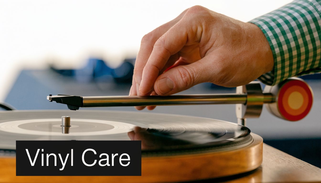
How to preserve the sleeve and record
Start with friction, because friction does most of the damage. A rough original paper inner can scuff the disc over time, so place the record in a fresh anti-static inner and keep the original inside the jacket for reference. That way you preserve the printed component without forcing the vinyl to rub against ageing paper every time you pull it out.
Outer sleeves matter too. Choose one with enough space that the jacket slides in easily and sits flat. A tight plastic cover can stress seams and corners, especially on older sleeves that have already dried out a little with age.
Transport is where many good copies start to decline. Carry records upright, packed snugly, and never slumped at an angle in a half-empty bag for an entire evening. Corners blunt quickly. Ringwear builds slowly, then all at once. On a Smiths sleeve, where the image often depends on restraint and subtle tone, that visual loss is not minor. It changes the whole mood of the object.
Clean before you leave home. In a venue, rushed brushing under low light often misses the grit that causes crackle during a quiet intro. If you plan to cue by hand, trim your motions. A hesitant drop and repeated back-cueing will mark an older groove much faster than careful, confident handling.
Why original Smiths vinyl still works in modern rooms
The sleeve is part of the set. People read it before they hear it.
That is one reason Smiths records still appear in thoughtful bar sets, wedding side rooms, listening sessions, and queer nights that want a sharper emotional palette than generic nostalgia can offer. You do not need a survey to see it. Pull out This Charming Man or The Queen Is Dead in the right room and the audience often recognises the signal immediately. The visual language carries wit, longing, camp knowledge, and a little defiance before the first chord arrives.
For DJs, that makes the record a programming tool as much as a song choice. The cover can cool a room down, focus attention, or prepare people for a turn from bright movement into something more inward. A strong example of that booth-side visual effect appears in this DJ booth scene showing how records shape atmosphere before the needle drops.
Collectors can use that same principle at home. If a duplicate sleeve is too worn to justify playing copy prices but too beautiful to hide, it is worth effectively framing these pieces to elevate their aesthetic appeal. Smiths artwork was made for walls almost as naturally as it was made for racks.
Use The Smiths when you want the room to feel selected with care.
Working them into an event without killing momentum
Placement decides everything. A Smiths track dropped cold into a run of high-gloss disco can feel like changing films halfway through a scene. The better move is to set the emotional key first. A left-turn soul record, a piece of jangle pop, a slower post-punk cut, or a moody 1960s track can act as the hallway that leads people there.
Tempo is only part of the story. Tone matters more. If the crowd is singing together, The Smiths can intensify that bond. If the room is chasing pure release, save them for the moment when people are ready to listen with their shoulders as well as their feet.
A short demonstration of handling and playback technique can also be useful before you put a cherished copy into regular rotation:
A few practical DJ habits help protect both the music and the object:
- Carry a backup option: a clean reissue or digital file can take the pressure off an expensive original.
- Keep sleeves away from drinks, condensation and haze residue: cardboard absorbs venue grime faster than many DJs realise.
- Use a stable cue light or small lamp: accurate handling in low light prevents slips, sleeve scrapes and bad drops.
- Save originals for moments that justify them: if the room will not notice the difference, let the archive rest.
Good Smiths DJing is really editing. You are editing sound, image, and memory at the same time. That is why care matters so much. A well-kept copy does more than survive. It keeps speaking clearly, in your collection and in the room.
The Enduring Allure of The Smiths’ Visual World
The lasting power of smiths record covers comes from their refusal to behave like ordinary pop packaging. They don’t flatter the buyer. They invite the buyer into a world of references, feelings and chosen faces. That invitation still feels refined.
The album sleeves gave the band a visual canon. The singles expanded it into a living archive of idols, outsiders and coded signals. For collectors, that makes each original pressing more than a sound carrier. For DJs, it turns a record into a mood-setting object before the music even starts.
Why they still resonate
Part of the answer is design. Restrained typography, strong cropping and carefully judged colour don’t age the way trend-led graphics do. Part of the answer is cultural memory. These sleeves connect listeners to film, television, queer reading, British melancholy and second-hand glamour all at once.
They also reward display. If you’re hanging a favourite sleeve or preserving a rare spare cover, it helps to think about effectively framing these pieces to elevate their aesthetic appeal, because Smiths artwork often works as wall art for the same reason it works as packaging. The image carries its own atmosphere.
Great record art doesn’t illustrate music. It extends the life of the music into rooms, collections and memory.
That is why these sleeves still matter in 2026. They remain tactile proof that taste can be designed, pressed, held and passed on.
Common Questions About Smiths Record Covers
Why don’t The Smiths usually appear on their own covers?
Because the sleeves were built around curation rather than self-display. Morrissey preferred found images, film stills and cultural figures that created mood, subtext and recognition. That gave the band’s catalogue a distinctive identity and made the records feel more literary and cinematic than standard pop releases.
Which Smiths cover should a new collector start with?
A clean UK copy of a common single or a later affordable LP pressing is usually the safest start. Learn how the paper stock, print tone and label design look in person before chasing expensive first pressings. Condition knowledge saves money.
Are bootlegs worth buying?
Sometimes, if you want an item for reference, curiosity or display. They aren’t substitutes for original Rough Trade copies, and you should never pay original-pressing money for one. Sellers should identify them clearly.
How can I tell if a sleeve has been damaged by storage?
Look for ringwear, spine splits, corner blunting, laminate lift, fading and waviness from moisture. On Smiths sleeves, image quality matters so much that even moderate wear can change the feel of the piece.
Do these records work at weddings and parties?
They can, if the DJ reads the room well. The Smiths are strongest when used intentionally, often as an emotional pivot rather than constant dance-floor fuel. One well-placed track can mean more than a whole cluster of vaguely similar indie songs.
Should I frame rare sleeves or keep them in storage?
If the sleeve is valuable, protect it first. Use archival sleeves and avoid direct sunlight. If you display it, frame it properly and store the record itself separately so the jacket doesn’t carry unnecessary strain.
If you’re planning an event and want a DJ who understands not just songs but the culture, mood and object-history behind them, explore VinylGold. Their London-based approach blends musical knowledge, careful programming and timeless taste for weddings, parties and events across South East London and Kent.